Designing Tripshepherd AI for Tripshepherd
Tripshepherd provides TikTok-style shorts linked to bookable travel experiences. As the sole designer, I worked end-to-end across both participant and host-facing features on mobile and web — from user research and flows to handoff. My work spanned the event detail page, social features, host profiles, and an event creation flow, supported by a starter design system I built from scratch.
0 to 1
B2C
Product Design
Marketplace
AI
company
role
Product Designer
team
CEO & CMO
1 UX Researcher
2 Devs (Pakistan)
1 PM (Pakistan)
timeline
Fall 2025・3-week project


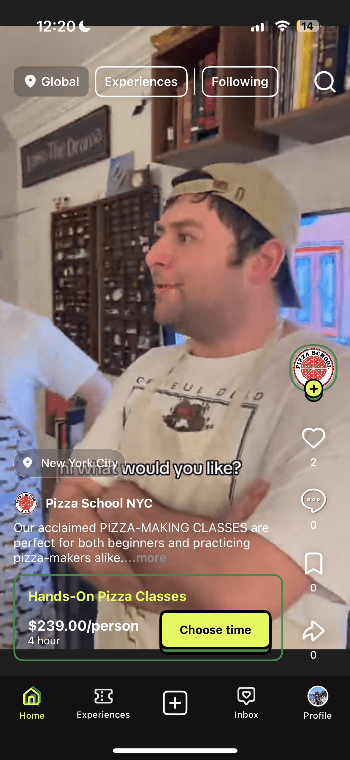


Browsing experience
context
A discovery model failing to scale for our travel marketplace.
Our organic bookings were low.
Despite strong video engagement, users were not completing bookings. At the same time, hosts were frustrated with the requirement to create short videos for submission.
Internal System
Demand
Supply
Participant
Discovery–conversion gap
Users primarily interacted through short-form video feeds but didn’t book experiences on the app.
Host
Hosts ≠ content creators
Uploading short videos is required for listing, but hosts are not content creators.
Internal teams
Design & technical debt
Fragmented UI and high technical debt slowed down shipping.
impact
What I achieved during this Winter 2025
4
Features approved for development
2
Features shipped
1st
Design system built
opportunity
The high-level vision for Tripshepherd was clear, but the roadmap to translate that concept into a tangible, scalable product remained undefined.
execution
Starting with diagnosing the system
To avoid treating this as a surface-level friction problem, I mapped the entire discovery-to-booking system. The flow revealed a structural disconnect that warranted further research.
Discover
Create event
Manage event
Book event
Participate event
Review

Host
Desktop-first
Further research needed
Content creation barrier
Feedback loop
Service delivery

Participant
Mobile-first
Hypothesis
Hypothesis
AI-powered workflow
Operating Within Startup Constraints
In a resource-limited setting, I utilized AI tools to speed up synthesis and explore variations. This allowed me to focus more on strategy, users, and cross-functional decisions. AI helped with the speed, while I stayed responsible for the what and why.
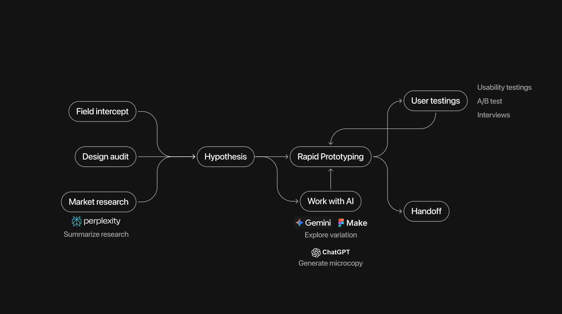
With human judgments
principles
Based on the systemic diagnosis, I worked with the CEO and Product Manager to define three guiding principles to prevent us from patching symptoms rather than fixing the structure.

Design challenges we solved:
1
Design for participant
2
design for host
3
design for internal performant
challenge 1: discoverability
How do we help users find experiences without hunting for data?
Two distinct user patterns were identified during testing.
Through moderated prototype testing, I identified two dominant user behaviors:
Casual explorers who still prioritize logistics early in decision-making.
Intentional planners who anchor geographically before browsing.
The video feed attempted to collapse both into a single linear scroll.
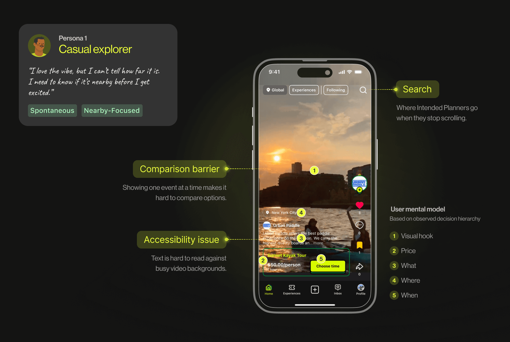
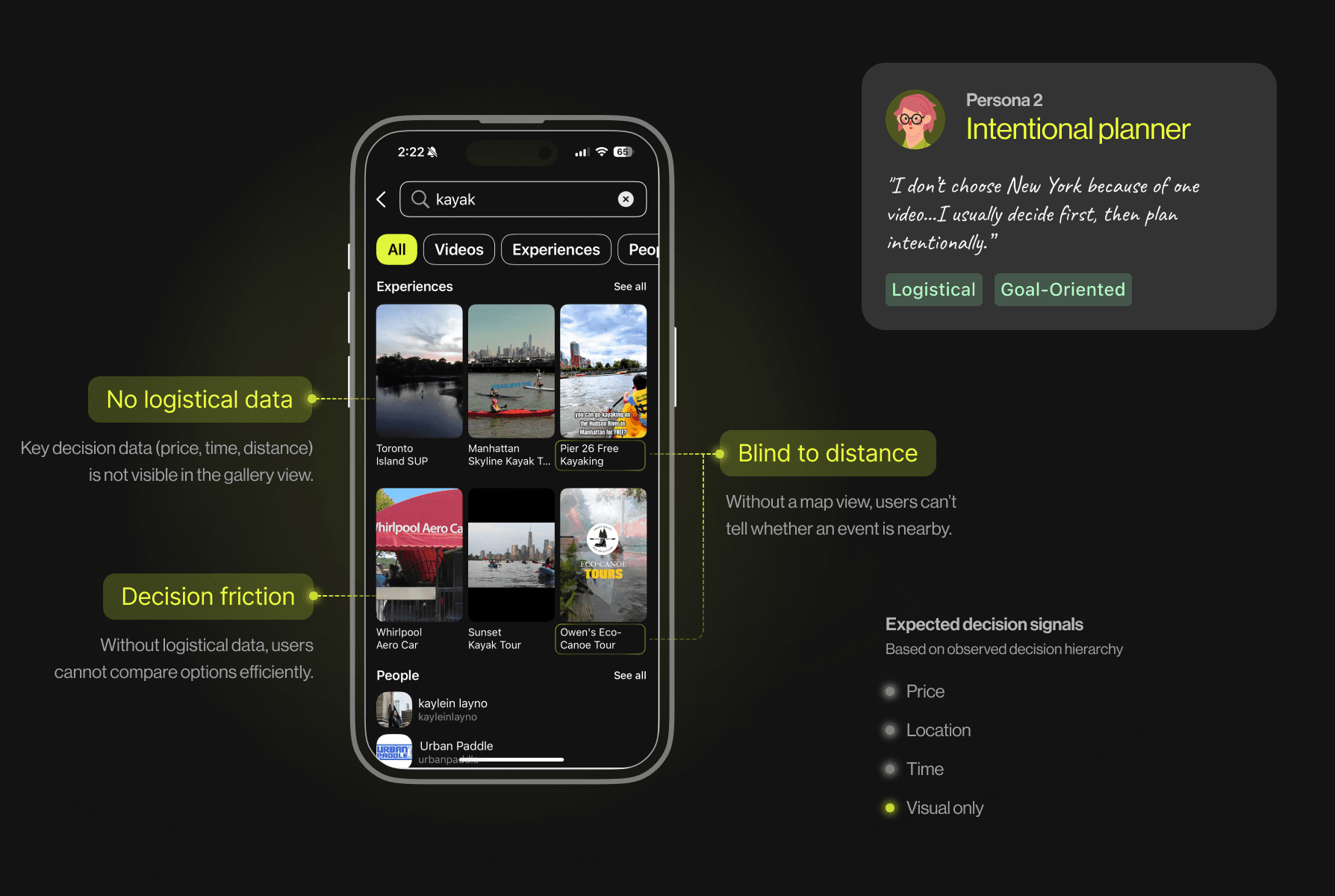
They were "mentally exhausted" because logistical data was buried under taps. So, how did we optimize information without users digging deep?
Testing information density assumptions
One assumption was that larger visuals would drive more interaction. I ran A/B prototype tests comparing a media-dominant layout with a logistics-forward list layout.
The List Layout won because it provided transparency at a glance.
View annotation
A/B test
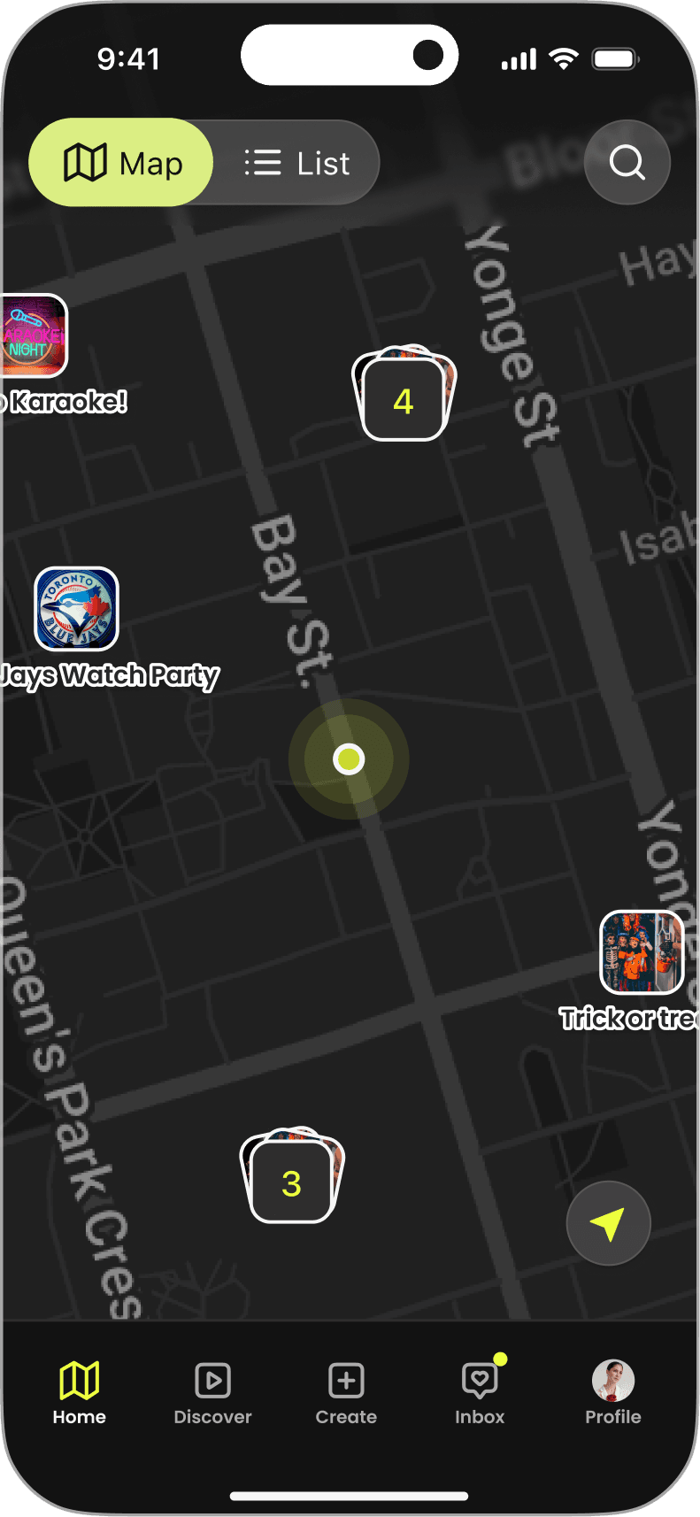
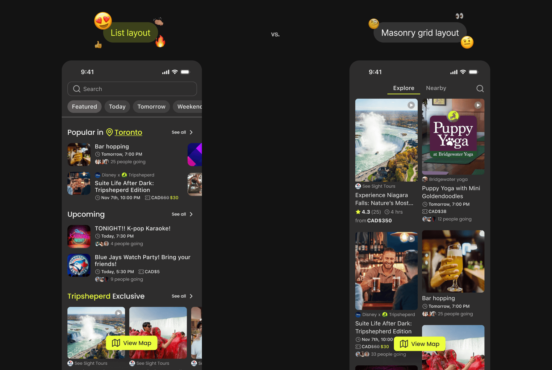
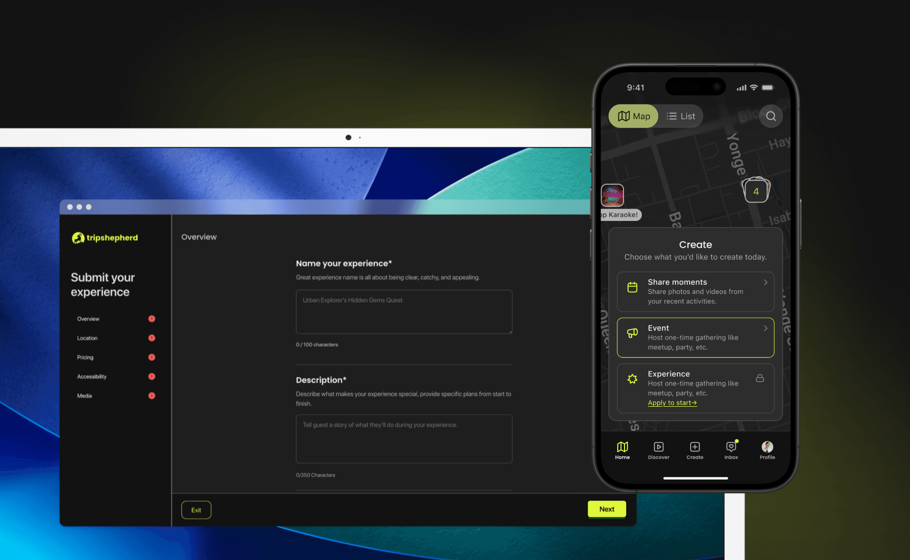
Our solution: A map + list hybrid system
Instead of optimizing the feed, I restructured discovery around spatial anchoring. The new system introduced: a Map-first entry point and a scannable List view to meet different user behaviours. By switching between views, the toggle gives users autonomy to choose the best one for them.

Hybrid Map/List views for different users
V1

V2

V3
9:41
Map
List
Version evolved to maximize the information density.
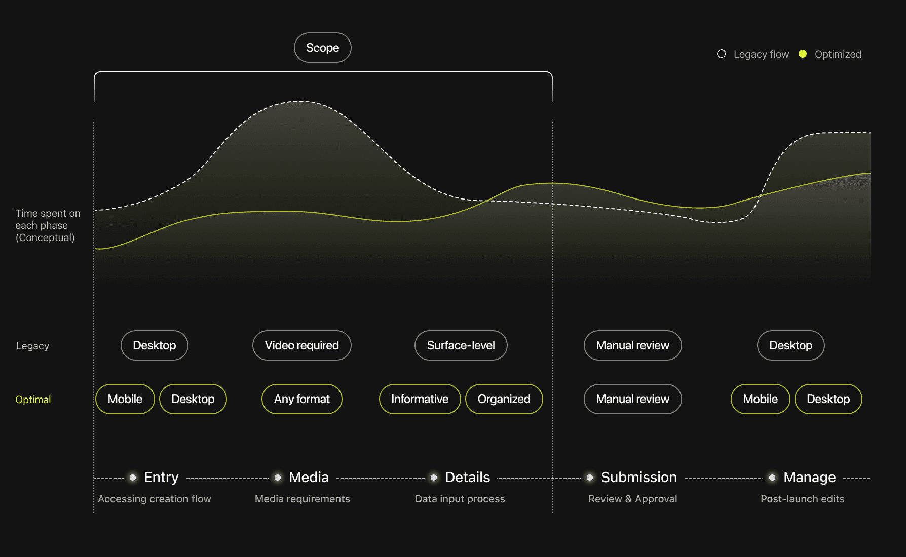
challenge 2: scalability
How do we redesign host creation for marketplace growth?
The supply bottleneck: not just content creation debt
Desktop-only creation
We optimized for participant mobility but constrained host contribution.
(Too) little logistical information
Lack of details reduced trust and clarity for participants.

Drop-off point
Video required for listing
Drop-off spiked at the final video step.
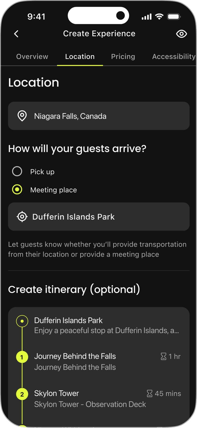
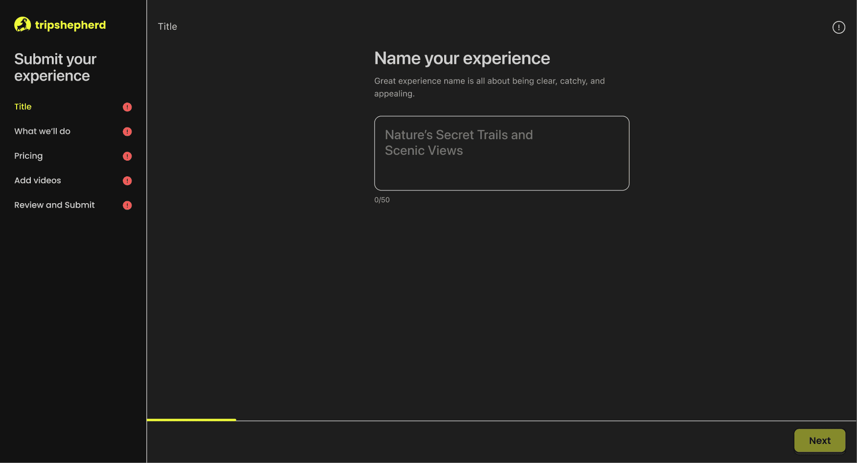
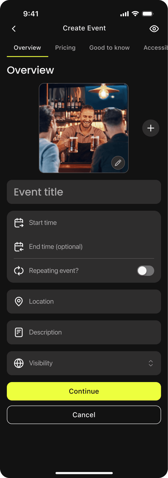
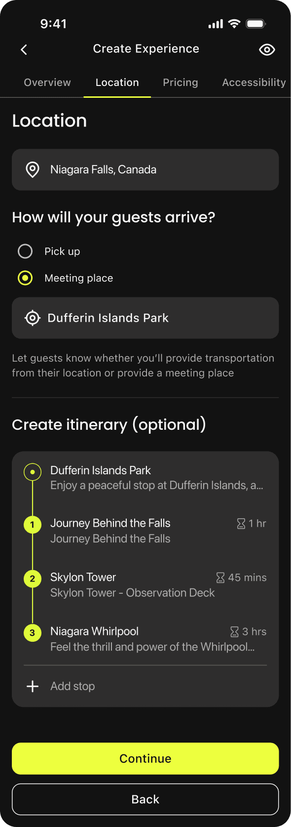
The Solution: A Modular, Mobile-First Creation Engine
To scale the marketplace, we had to move the creation tools into the host’s pocket, so it turned a "sit-down task" into a "3-minute mobile update."
Make listing more informative while on the go, and turn found time into marketplace supply.
By modularizing the experience page, we moved away from "sketchy" minimal listings toward a more informative form that builds user trust while remaining light for the host to manage.
the pivot
Rebuilding the information architecture
Making Spatial Context the Primary Entry
The redesign required restructuring navigation.
This repositioned the product’s core logic from feed-driven discovery to location-driven planning. Navigation now reflects how users actually decide.
Search
Home (video feed)
Experiences
Upload
Inbox
Profile
Create
Discover
Home (map)
Launch screen
Short video feed
Experience gallery
Add video/image of participation
Before
After
Short video feed
Upload participation
Map
List
Create event/experiences
Map became the default entry surface.
Video shifted to secondary inspiration.
Design change 3: performant
How do we ship quickly while maintaining design quality?
7+ features shipped in 6 months — no design system.
10+ inconsistent button variants, 30+ unused hex codes, zero shared components.
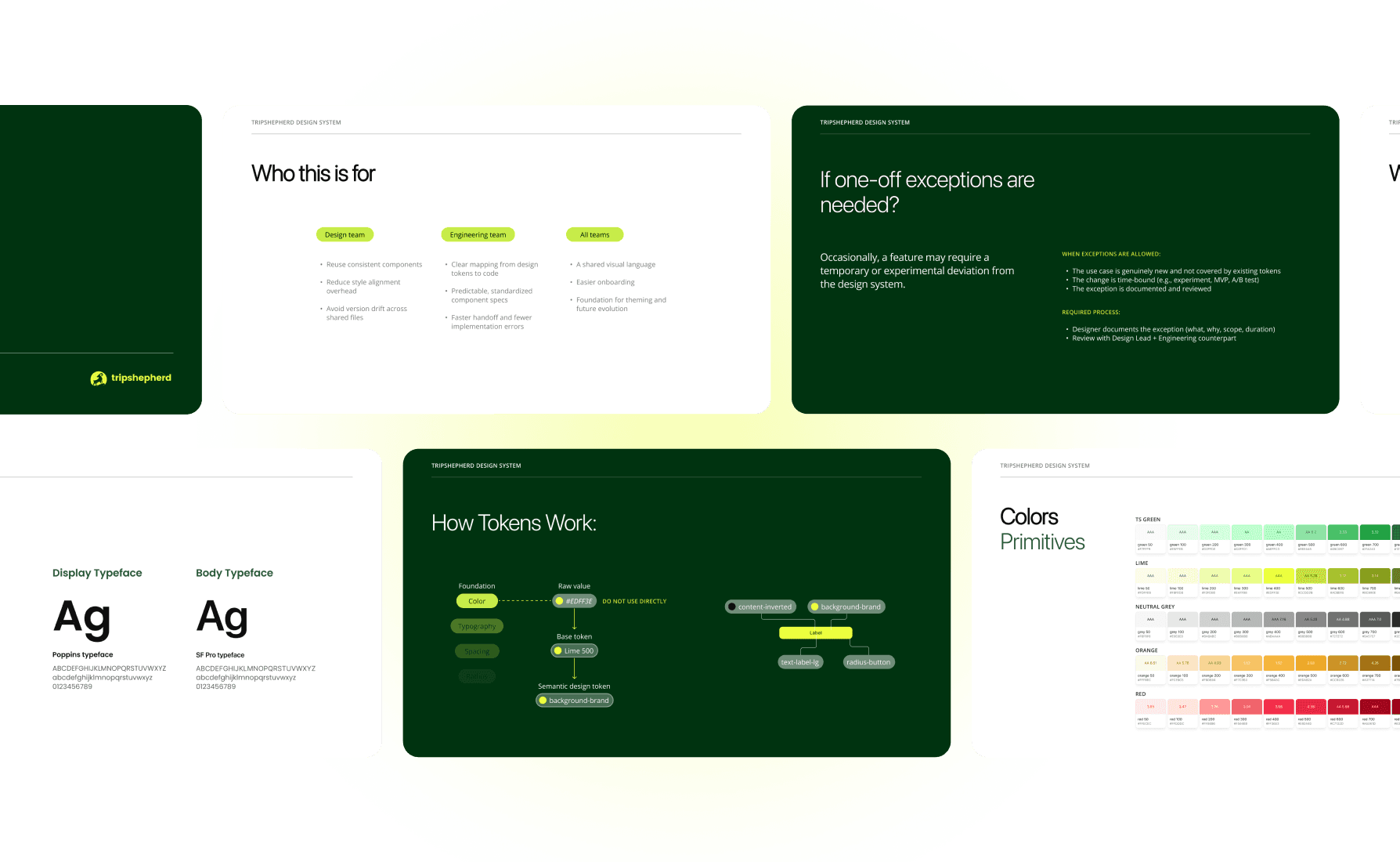
So I built and introduced a Starter Design System.
Instead of proposing a large overhaul, I positioned the design system as a prerequisite for shipping faster to the CEO. I also created introduction slides for documentation. Working across time zones with engineers in Pakistan, the documentation help reduced ambiguity and minimized alignment meetings during a high-uncertainty pivot.
reflection
Retrospective
If I have more time
I would measure Map → Booking conversion vs. Video → Booking conversion to quantify the business impact of the pivot.
Further align design tokens with engineering variables to reduce implementation drift.
Takeaways
Ambiguity is scary, but I embraced it during this internship, and I learned a lot. During a strategic pivot with fluid requirements, I learned to rely on research and rapid prototyping with AI to create clarity, rather than waiting for fully defined direction.
Observing features ship without a design system — and seeing inconsistencies accumulate — made me realize that infrastructure cannot be postponed until “later.” Even without immediate monetization pressure, foundational work needs intentional capacity, or debt compounds quickly.
Using AI and lightweight code to prototype realistic map interactions expanded my prototyping capability, but also reinforced that acceleration only adds value when paired with deliberate evaluation and product judgment.


My first day of internship started on a helicopter🚁!
✦
View another case study where I did research at RBC