Shipped
0 to 1
B2C
AI
Overview
Designed Tripshepherd's feature to boost users' confidence in booking travel experiences on short videos after its 1st MVP launch.
My role
Product Designer
Team
CEO
PM
UXR
FE
FE
BE
Timeline
September - December 2025
01 Overview
Impact Overview
Designed Tripshepherd's feature to boost users' confidence in booking travel experiences on short videos after its 1st MVP launch.
Impact Overview
Designed Tripshepherd's feature to boost users' confidence in booking travel experiences on short videos after its 1st MVP launch.
Impact Overview
Designed Tripshepherd's feature to boost users' confidence in booking travel experiences on short videos after its 1st MVP launch.
problem
Users browse travel experiences through short-form video but rarely book.
1
Lack of confidence in booking experiences on the app
Users are suspicious of booking an experience when there are no reviews, ratings, or social proof to help them evaluate an experience before tapping through.
2
Disconnected feeling from scrolling to booking
Users felt the gap between scrolling through shorts to book an experience right away, with nothing in between for users who weren't ready to book.
3
Budget and commitment vary per moment
Without onboarding or an algorithm, every user saw the same generic feed.
Before
After
02. research
So, how did we land here?
To dig into the root cause of low conversion rates on short videos, I, the only designer, worked with the UX Research Intern, researched, and established the foundation of the design process (as the CPO had just left).
Step 1: Interviewing Gen Z audiences and users
While the number of downloads increased in October 2025, the month after didn't have any bookings via short. We began conducting interviews with both prospects and current users to understand what stopped them from booking.


Step 2: Domain research for opportunities
Because Tripshepherd sits at the intersection of social commerce and travel. There was no clear precedent for it. Therefore, I studied products from each industry and looked for design opportunities.
Direct - Travel industry

GetYourGuide

Viator

Airbnb


What we found
Deep trust signals through reviews, host profiles, and rich information
Fails to convey the vibe of the experience
Heavy detail that requires commitment before users see what matters
Opportunity areas
Visualize "what it feels like" before the tap-through, not just after
Recommend relevant experiences that match users' tastes and budgets.
What we found
Strong inspiration layer that pulls users into discovery effortlessly
Native video-to-shop integration built for products
Social proof feels community-driven, but doesn't translate to high-stakes purchases
Opportunity areas
Social proof presentation at scroll speed, not research speed
Video-to-shop connection patterns that feel native to the feed
What did we learn?
Social commerce inspires but builds trust for products. Travel builds trust but only after tapping into the details. Tripshepherd's opportunity is to combine both: surface experience-level trust at the speed of a scroll.
Through these steps, we identified 3 major frictions that block users from scrolling to booking in Tripshepherd.

Why are these problems, problems?
Users are blind to the detail page entry point, so booking feels too big a commitment.
"Choose time" button appears as the only thing that looks like a button, while the detail page CTA goes unnoticed because nothing signals it's tappable. The flow jumps from casual scroll to high-commitment booking with nothing in between.

Social features don't necessarily signal credibility, so users are hesitant to book.
Social features like saves, likes, and shares signal engagement, not credibility. There are no ratings, reviews, or sales numbers to help users evaluate whether an experience is worth their time.

Making travel decisions depends on budget/proximity, though generic feed is not relevant to users and their needs.
Without onboarding or an algorithm, every user sees the same shorts. The system didn't know users' taste, budget, or proximity — so users scroll without resonance.
Yeah…More problems need to be addressed.

How did the pain points impact our business?
Low booking conversion=no revenue
High bounce rates
Wasted acquisition spend on passive scrollers
Hard to compete with pure entertainment apps or traditional booking platforms
Actionable insights from pain points
Blindness to the scroll-to-book flow
Bridge intent and interaction by signaling detailed information exactly when user engagement peaks during browsing.
Lack of credibility in social shorts
Anchor inspiration in validation by balancing aesthetic engagement with objective, trustworthy data.
General feed
Contextualize affordability early to prevent users from dismissing destinations as unattainable fantasy.

How might we design Tripshepherd to turn travel shorts from a sense of entertainment
into a credible and relevant booking experience?
03. Solution exploration
So, how did we solve the challenge?
Exploring solutions as a team
After identifying the core issues, we ideated the solutions collectively and prioritized the solutions using the Impact vs. Effort matrix. Key stakeholders included the CEO, PMs, UX Researcher, and Engineers.

Constraint: no recommendation algorithm exists yet. Any feature that ranks the feed or infers taste must build that infrastructure first, so it counts as high effort.
Given the tight timeline, we decided to prioritize the quick wins: trust and clarity features that ship on existing data, and we'll collect user behavioral data for future iterations.
Finalized features focused on trust building and laying the foundation for personalization.
{image show how these three help grow the conversion together}
Fix CTA Blindness
Trust Building
Vibe matching
Highlight the entry of detail page
The blindness wasn't just that the card didn't look tappable. It was that "Choose time" was the loudest action on a surface where almost no one was ready to choose. Removing it from the short and reserving a booking for the detail page matches the user's actual readiness.
Before: Prompt the user to book while the user doesn't have enough information to make a decision yet
After: As the user stay with the screen a bit longer, prompt the user to click into view more

V1-Raw concept
Chevron signals tappable
"Choose time" asks for commitment too early
Users want to understand details first before deciding to book
V2-Dynamic CTA
Delay matches natural read-then-decide rhythm
Removes booking pressure from feed
Delay adds friction for high-intent users
Final prototype-V2
Trust building-AI summary of reviews and details
Wireframe iterations

V1-Floating chip (rotating)
Minimal visual disruption
Hint AI-summarized with icon
Rotation can be missed

V2-Quote card
Most credible, looks and reads like a real review
"AI summarized" sets expectations
Looks too busy

V3-Tag row inside card
Scannable at a glance
Limited text counts, oversimplify context
Feels algorithmic
Final prototype
Prototype created with Figma Make
Vibe matching prompt
Without a feed algorithm, personalization wasn't feasible yet. So we prioritized the quick wins: trust and clarity features that ship on existing data.
But an algorithm needs data before it can exist. So I designed these features to collect that data as they work, laying the foundation that personalization will build on.

V1-grid layout
Clear, all options visible at once
Hard to visualize the vibe
V2-dynamic pill
No disturbance to scroll
Limited text counts
Hard to get attention

V3-Swipeable carousel
More interactive
Hard to visualize the vibe
Risk of users not realizing more options exist past the visible one
Final decision

Iterated from V3-Video card carousel
Vibe is shown, instead of a pure text
Swipe pattern is consistent
Final prototype
Prototype created with Figma Make
04.Final design
So, how did we solve the challenge?
Three connected layers, each addressing a different point of friction between inspiration and booking. Together they turn the short from a passive watch into a confident decision.
Enhance the trust signals and highlight the CTA button's affordance.
AI review summary surfaces what travelers actually felt
Rating and booking count establish credibility at a glance
Card and action are now visually distinct, no gesture confusion
Vibe matching — laying the foundation for personalization
Once-a-day cadence captures fresh intent without nagging
Skippable for users who'd rather just browse
Every selection becomes training data for the algorithm to come
05. Retro
If I have more time, I'd
Validate the booking impact.
We measured tap-through to the detail page, but I left before the data on booking conversion came in. The next step would be to confirm whether the trust layer actually moved bookings, not just intent.Close the metadata gap.
The vibe matching feature is foundation-laying, but it can only deliver real personalization once the experience tags are complete and consistent. I'd partner with the operator team to design the tagging workflow itself.Test the "View Details" delay timing.
We picked a beat that felt right, but I'd run it against shorter and longer variants to see how it affects both tap-through and time-on-detail-page.
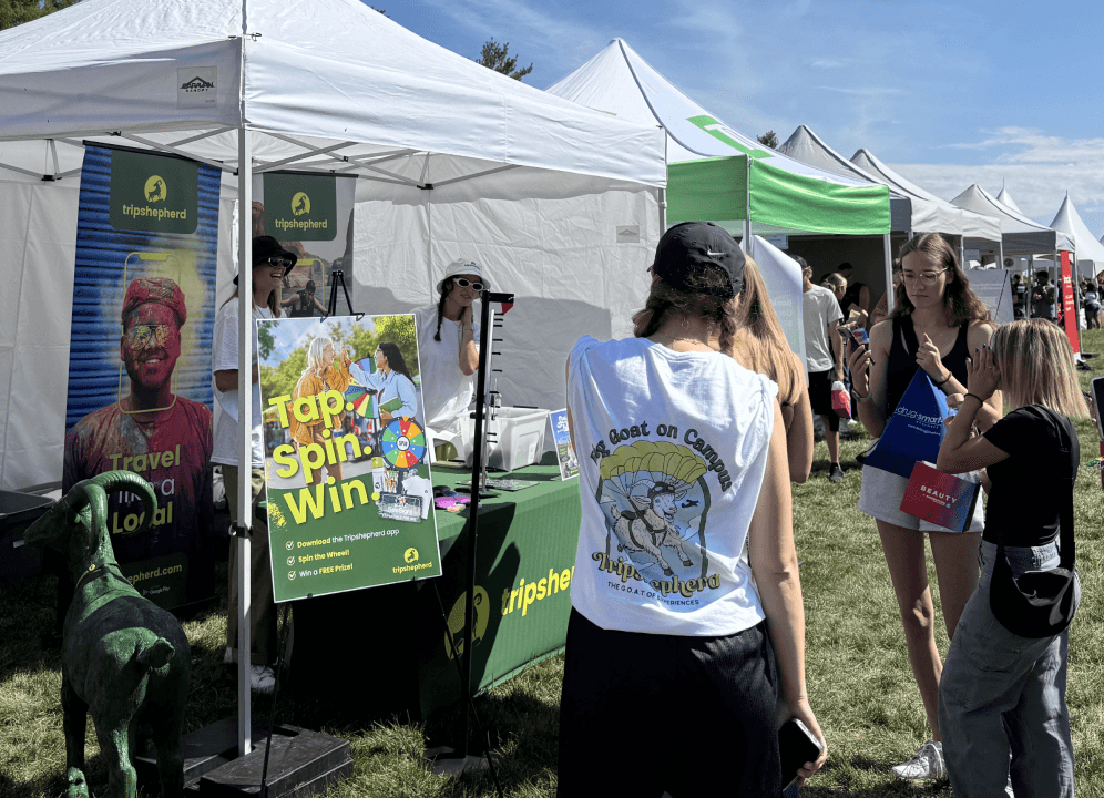
Some meaningful moments!
Takeaways
I learned to separate problems from symptoms. The team wanted to add more — onboarding, AI, social. Research showed the real issue was simpler: users couldn't tell if an experience was right for them, and the only visible action asked them to commit too early. I grew comfortable arguing for less in the right places, not more.
I learned how to write design rationale that survives engineering. When I drafted a "context-aware CTA," engineering pushed back on the term. Splitting it into a V1 rule-based version and a V2 algorithmic version taught me that defending design isn't about holding your ground — it's about knowing which part of your idea is actually buildable now.
I learned that design doesn't have to wait on infrastructure. The vibe matching feature wasn't blocked by a missing algorithm — it was blocked by incomplete experience metadata. Defining the tag taxonomy became a real design contribution. I grew into seeing the foundation as part of my job, not someone else's.


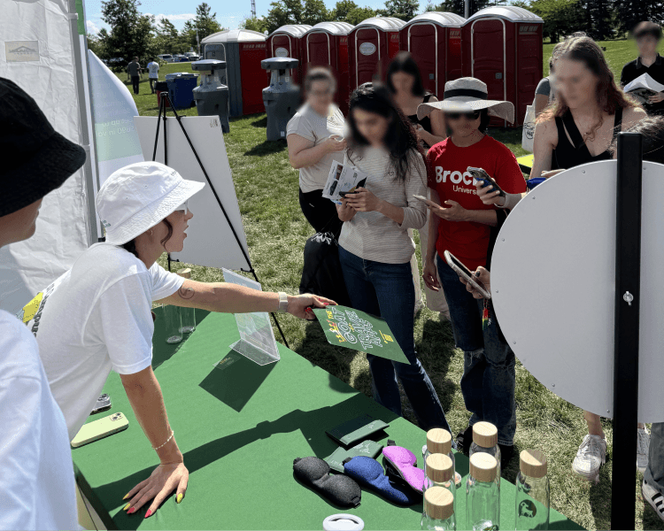
My first day of internship started on a helicopter🚁!
✦